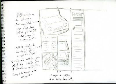
These are some initial sketches I did for the car layout based on the photos I took and the research I'd collected on existing spreads. (These are all found in the sketchbook accompanied with this blog).
Out of the ideas I've had so far I'm quite interested in the one above. I want to move away from the more formulaic designs of car reviews and do something more like Retro Car or Audi Magazine where they use one main image as the background. I think for the Ford Fiesta this would work because it's so well-known and such a common sight on British roads that one bold eye-catching image would be instantly recognizable to an audience that was interested in cars.
Since the article is more about how the car feels to drive rather than analyzing all it's features, I don't need to explain to the audience what it looks like from different angles because it's iconic enough that everyone already knows. The tone of voice implies the audience has prior knowledge of this car before turning to this spread, which is highly likely. If I can make the car look more dynamic I think this will help sell the article in this light. As the article suggests, it should look fun, excitable, and still relatively modern.
Also on a personal level I do want to gain experience in setting type against a photographic background so I think this will be a good opportunity to do so.


No comments:
Post a Comment