Saturday 20 August 2011

More Typographic Spreads

 I thought this spread was really interesting. I like the way the designer has used the typeface to create an image out of the letters. I also noticed that they have used different weights of the font which shows the reader more styles of the typeface.

In this spread the designer emphasizes the typeface's heavy weight by setting the letters really big and fitting them together like blocks. The layout of the article reflects this as they have used two wide columns with no line breaks which form two large blocks of colour on the page. I thought this was interesting as I hadn't considered using the article to also show characteristics of the typeface.

Even though type is used in these spreads there is no clear grid apart from the main article. The visual arrangement of type that accompanies it is often free to be placed wherever the designer wants. Although in most spreads it is clear that the designer has chosen to position all the type in a way that balances the spread nicely.

Friday 19 August 2011

Typographic Spreads

For this brief I'm keen on doing a typographic piece. I'd like to choose a typeface and write an article about it whilst displaying it in an interesting way that highlights it's characteristics.
This is one example of a typographic article. The way the designer has rearranged Rockwell in this spread reminds me of an avalanche or a rocky mountain. I'm not sure if that was what is supposed to be implied. I have noticed however that the designer has grouped letters together in a way that highlights aspects of the shape of the letters, e.g. - the O and the C together highlight the circular shape that they're both based on. Additionally the K and W are connected via their serifs which highlights Rockwell's chunky slab serif design.
I thought this design was interesting. By setting on letter really large across the spread the reader can see the style of the typeface in greater detail. I think it highlights the shapes that make up the letter, especially through the way the W appears trail from the bottom corner of the page which angle in which the letter sits at. It also makes the overall design more visually interesting and, I think, emphasizes the contrast between the thick stem and the thin serif.

The article itself is quite short but I think the designer has made good use of white space with this more minimal approach. 

Tuesday 16 August 2011

Further Development of the Spread

I added the background I'd created in Photoshop to the spread and this was the result. I think it works amazingly with the characters standing in the middle. I really adds atmosphere to the design and now the characters look like they have a reason for standing there. It also adds dimensionality to the spread as the characters appear to stand in front of both the background and the text & imagery, making them more eye-catching. Not to mention it successfully makes the spread look like part of the Back to the Future brand using similar colours, themes and further iconography to appeal to it's target audience.

I changed the colour scheme of the type to white as this worked better against the now darker background. The actual background image was placed in a text box that covered the whole spread but was cropped in a way that the objects in the background didn't interfere with the text. I really feel this is a vast improvement on the design as a whole. Everything seems to be more unified under a central theme.

Final touches include adding captions and little design cues to help the reader follow the spread. e.g.- little arrows at the start of captions which subtly point to the image they're referring to. 

Creating a Background

After creating most of the spread I noticed it seemed quite bland, or just not very 'Back to the Future'-esque. I think this is because of the amount of white space in the background. The characters are posing but don't look like they're in any sort of situation.

Like the previous articles I'd looked at I wanted to immerse the article in the style and themes of the film, so I had an idea to create a background for the spread that would add a clearly defined Back to the Future feel to the spread.
On the official website I noticed the game designers have created a poster for the game that is a throwback to the original theatrical posters for the film. This gave me a good idea for a background. I decided to recreate the background featured in these posters for my spread. Not only is it visually iconic to fans of the series but it's vibrant and not too busy because of the way it's quite stylized. Thus it would probably work well as a background for the article as text should be legible.
I started off with a stock image of a cloudy night sky. I chose one I thought had a similar look to the one in the poster. I put this into Photoshop. 
I made the blue of the sky more vibrant like the poster using the brightness, hue and contrast tools.
 Then I darkened the top of the image to make it look like it was fading darkness. This was done using a layer ontop that was all black and then faded out using a layer mask.
 The sunset effect was created using the gradient tool and another layer mask ontop of that to recreate the orange fading into the blue. Lots of movies use the mixture of blue and orange in their posters as they compliment each other and suggest action danger and suspence. They also suggest the clashing of two worlds or ideals when placed directly next to each other.
 The shining light from the car was created by drawing triangles emanating from the corner of the frame. Then a slight blur and lighting effects were added to enhance the shining appearance. I chose to keep this confined to the corner and without the car because I feel this would make the background too busy to lay type over. The rest of the background is dark and so a large white area would heavily contrast and mean the text would have to be different colours to be legible.
Finally the road and horizon were created using a shape tool and noticable film grain was added over the whole image (as is the style of the posters). I chose to set the road and mountains lower down than the posters actually depict them as I didn't want them to cut through the article half way down the page. The article should fit nicely in the area where the sky is.

Building the Grid / Creating the Spread

To start creating my spread in InDesign I set about building the grid first before dropping in any images or text. However for this design I was basing a lot of the layout around the postion of the cut-outs in the center. I decided to start off by getting the position of these images right before I put anything else in. I also tried to leave enough space between them so that not much information would be lost in the fold, but keeping them relatively close.
I created the columns and image boxes next. I experimented with lots of different column grids but I settled on an 8 column grid as this allowed me to create 4 medium sized article columns that would text wrap nicely around the images whilst leaving equal space on either side because of the equal number of columns. This helps maintain the centralized design of the layout. This column size also best fitted the length of the article I was using.
Next stage was importing the actual article and creating the header. The article title I chose was "Blast from the past" - I didn't want to use the title of the game because that would have been more boring. Article looking at existing magazines they often have an interesting title that graps the readers' interest.
 For the header style I found a typeface called Ozda hosted on dafont.com. I wanted something that had a distinct science-fiction feel to it and also quite retro as this would tie-in with the style of the film. Additionally I chose this typeface because it was very bold similar to the logo of the film. In this way I hoped to bring some character into the article using type and not just images.

The reason I didn't just go for the Back to the Future logo typeface was because I wanted something that reminded readers' of the film but wasn't just a straight rip from it. In this way the magazine can be more creative and create it's own style whilst clearly showing inspirations from it's subject matter. I also found this typeface to be much more versatile and easier to use with a grid. The name and postioning of the words was inspired by the Back to the Future title.

I then imported all the other images I wanted for the spread and created the pull quote and final verdict. I specifically chose images that would best fit the shape of the image boxes I had. For example the image of young Doc on the far right was a portrait image so it best fitted that particular image box. I also chose to use close-up shots as the image space I had was quite small and this would best balance the larger images of the characters in the center.

Monday 15 August 2011

Creating Cut-outs in Photoshop

For this spread I'm going to be using character cut-outs of Doc and Marty, the main characters in the Back to the Future series. To do this I will be using Photoshop to remove the background before importing into InDesign.
This is the image I started off with. It should be fairly easy to extract the characters from this image. I'm using the highest resolution version I could find. I think it was 1024 x 768
After opening the image in Photoshop I used the polygonal selectional tool to draw around the outline of the character.
Then I took that selection and cut it. I made a new Photoshop file and pasted the cut-out into it. Even though I had a blank background, in order to make the rest of the image transparent I had to first delete the layer underneath so that there were just the hatched markings left.
And I saved it as a PNG file since they're able to save transparent layers in image files.
I did the same for Marty. Now I have two cut-outs that are ready to be imported into InDesign when I need them. 


Development

I started to develop one of the ideas I was most interested in. I really like the idea of having the iconic main characters back to back in the middle. I think it would really bring the two pages together and I can balance the spread around the center. I want to have the characters looking at parts of the spread that are supposed to attract attention or be read first. So for example the left character can be facing the header with the header aligned to the top of the characters head so the eye is lead across from one to the other. The other character can be looking at the pull quote. This is useful as the characters in the center will be the first thing people see which then lead the reader to the next stages of the layout. The article or the pull quote.

As I wrote under the sketch it's hard to tell how many columns I should use at this moment. It all depends on how the cut-outs fit into the spread as I want the article to be text wrapped around the characters so they're all interlinked. This will mean the column width can't be too narrow so a 4 or 5 column layout may be suitable. I think when I start building the grid I will put the character cut-outs in first and then figure out the best column number for the job.

Initial Ideas

These are some initial thumbnail sketches I did for this layout. After looking at some of the images I found for this game I was really interested in using character cut-outs of Doc and Marty (the two main characters) for this spread. I experimented with different ways I could place them on the spread. I also jotted down some notes in the sketchbook.


For each idea I also tried to analyze the balance of image and text by drawing a scaled down version of the layout and grouping images and text into colour coded blocks based on the overall shape. This helped me to get a clear idea of how the spread might flow as there would be lots of different types of information on the page.


Article


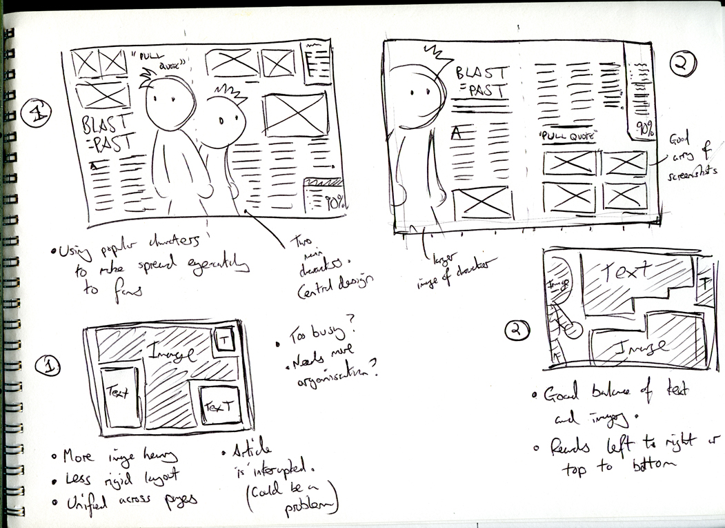
This is a review of the game from ign.com. I think this will be a suitable article as it covers all the aspects and is a good length to fit on two pages. I will use this article as the basis for how I design the spread and will try to draw on conclusions from the tone of voice and the subject matter when deciding what images and design elements I want to use.

Back to the Future is one of those films – one of those franchises – just about everyone loves. The DeLorean, Marty McFly and hoverboards are all part of our lexicon thanks to those three films, and although there were some early attempts at Doc-inspired video games, you'd have to be crazy to decide in this day and age that you're going to develop a game based on something so beloved. Well, Telltale Games is that crazy, and after playing through the first episode of the Back to the Future game, I'm happy that the folks over there are.

 Back to the Future is a point and click adventure game picking up a few months after the third film. You play as Marty McFly and start dealing with the fact that your best friend -- Doctor Emmett Brown -- is gone after climbing into his time train and sailing off at the end of the third flick with his family.

Yes, this isn't a remake but another chapter in the Back to the Future legacy. I never really thought about life after "The End" of Back to the Future III, but here, Marty is missing his best friend who has been gone for a number of months. At the same time, the city of Hill Valley isn't cool with Doc not paying his mortgage, so it closes in to sell off all his crap. Preventing all of Doc's secrets from being sold off is the player's first real mission in the game. As you guide Marty around the lab you're going to recognize the dog food machine and wall of clocks while as the same time get a feel for how the game plays – click on objects and people, investigate and maybe use an item from your inventory to get a different response or result from the interaction.

 Eventually, the DeLorean shows up, we find out Doc is in trouble, and Marty's got to figure out when that trouble is going down and how he can help – and all of that's actually a lot of fun. Telltale's telltale humor is intact here as you're treated to witty dialogue and fun conversations. Remember, you're picking Marty's dialogue responses, so you can branch things in a number of ways.

 However, the nicest touch in the game is the love and care the Back to the Future universe is given. I've waxed on about the attention to detail in a previous preview, but the best example from the actual game came when I climbed in the DeLorean to shoot back in time. I clicked to punch in the date on keypad, but Marty couldn't because I hadn't turned on the time circuits via the little handle in between the seats. That is such a mundane Back to the Future detail, but Telltale added it to make the game feel like you're playing a part of this mythos. For a BTTF nerd like me, that's awesome. The game is littered with nods like that. You need the help of a Strickland to figure out the mystery at hand, downtown Hill Valley has the theater and courthouse it should, and you can even bust out a "What the hell is that?!" to get out of a jam. Of course, that also means that the BTTF cliches we know are back – Marty waking in bed, the requisite chase scene, etc. Most (if not all) are welcome, but if you were sick of that formula, know it hasn't changed much.

 Now, I'm not the world's biggest adventure game fan. I'm familiar with Telltale's work with Sam & Max and Strongbad, but those weren't franchises I was into, so I didn't give them much time. The puzzles in Back to the Future are clever but a bit simplistic. That's good because the game's going to draw in so many new players, but it's worth pointing out that there was really only one time where I was stumped with a "What the hell do I do now?" puzzle. Still, trying to get people out of the room so that you can root around through their stuff or so that you can build a rocket is entertaining and fun.

That simple feel carries over – in a way – to the art style. Doc, Marty and the other main characters look great and so does their world, but players need to know that Telltale's aiming for a cartoonish theme here so Hill Valley is bright, colorful and not huge. You'll only wander into a few buildings in this episode to complete your quest. Also, lip syncing is only kind of there as mouths tend to just move at random when someone's talking. It's not a huge knock, but the story's being told very cinematically and it's based on a film so it can take some getting used to.

 Lip syncing won't be that big of a deal, though, because Telltale really outdid itself with the voice work. Christopher Lloyd is back to play Doc and the guy playing George McFly sounds pretty good, but A.J. LoCascio is amazing as Marty. Michael J. Fox let the developers use his likeness but not his voice. So, Telltale went out and got LoCascio, and the guy sounds so much like Fox that it is truly scary. There's a point when Marty screams and if I didn't know better, I'd swear it was pulled from Fox screaming on Mr. Strickland's porch in Back to the Future II. The music is pretty much the classic instrumentals pulled from the movies and tweaked here and there, but they do get used over and over. I was OK with it, but having part of it play over and over while I worked on a puzzle did cause a coworker to tersely ask me if they only had that one song.

Content

Video game reviews rely on a variety of images from the actual game as well as any promotional artwork that has been produced by the creators. To gather items I could use for my spread I went to the official website of Back to the Future: The Game and found some downloadable screenshots. I also sourced images from ign.com, gametrailers and google images.

Close-ups
These shots will be useful for balancing the spread against larger images. They can also be easily placed in column widths or next to columns as they can be scaled down without losing too much detail.

In-game Shots
These are direct screen shots from the game showing the playing environment, controls, typical scenarios etc. They're useful for showing the reader a more accurate depiction of the game. They can also be useful when explaining how the controls work in the review. They're usually considered to be long shots as they're designed to be shown on TV screens and not a magazine layout. So they should be set quite large in order for the reader to see everything that's going on in the image clearly.

Promotional Artwork
Promotional material can be really useful in a double-page spread as they have an eye-catching artist quality that can be used to draw the reader into the article. They can also often be used as cut-outs which add visual interest and variety to the spread because everything isn't contained in a box. Additionally promotional artwork is mostly designed to make the game look more exciting or more impressive whilst emphasizing important characters and setting the scene. This makes it a good idea to include in my spread as the characters in Back to the Future are one of it's most iconic features.


Depending on the layout and quality of the image, sometimes promotional artwork makes for a good background to the layout. It's one way to make the spread look like it's consistent with the same branding. This is something I will consider when designing this spread.