Thursday, 4 August 2011

Building the Grid

In order to transfer my design into InDesign I had to first set up the document and create the grid I'd be using the place my article and image into.

I've decided to base my page dimensions on Audi magazine because I drew alot of my inspiration from there and it's also slightly wider in it's proportions than other car mags which means my image, which is landscape, should fit well across the spread.

The page dimensions are 210 x 275mm. Similar to A4 size but shorter by 22mm.

I set the number of columns as 6 to start off with. This seemed to work in my sketched plans but may be subject to change. Most magazines I looked at (Audi included) used a gutter width of 4mm or just above that so I left the gutter at its default setting of 4.233mm.


I now had the basic page layout for my spread. I dropped the column height down by 8mm to allow space for any page headers I might want to include later on such as a feature name or the name of the magazine etc.
Last thing to do was to create the template for my design by drawing image and text boxes where in the desired positions. Once I have the basic template I can then drop images and text into these boxes and the spread will start to take shape. It's a good idea to plan out where these boxes are going to go before importing any actual articles or images because you can check the spacing and alignments of each element clearly. I filled the article text box with placeholder text to get a rough idea of how much space it would take up compared to the rest of the spread. I still need to finalize the article before I put it into the layout.
It became after adding the placeholder text that the article size I'd originally planned would be too thin. When the text is 7pt size you can only get a few words in one line. So I'm changing the columns so that they each utilize 2 of the over column widths spliting the page into 3rds instead of 6ths. However I am now aware that the space between the back of the car and the left edge of the article will be thinner. I may have to make further changes once the image is dropped in.


Creating a Moving Shot

I was looking at this image I had in my research and it seemed to me that the car looks really crisp yet the background is supposedly rushing past quite quickly. It's almost as if they took a stationary shot of the car and superimposed it onto a moving background, or added the motion effects in post-production.


This gave me and idea for my layout. My problem is that it's very difficult to take a shot of a moving car because you need a professional steady camera and you also need another car that can go along side at the same speed, which I don't have. So I thought what if I can create a moving shot for my spread using an existing stationary shot of the car. I know how to create motion blurs in photoshop so it wouldn't be that hard to do.


This is the result. I took a shot that best matched the one in my sketchbook plans and used Photoshop to create what I think is a really convincing moving shot of the Fiesta. The effect was created by applying 3 different motion blurs, each at different angles, which all point to a single focus point (the end of the road in the distance) thus creating the illusion of perspective and making it look like the camera was moving in the same direction as the car. I think added another layer on-top which just the car in it's original state, which made it seem as if the camera was moving at the same speed as the car. I also added some radial blur effects to the wheels to make it look like they were spinning.

Overall I'm really pleased with how this turned out. The contrast between the motion blur and the car being in focus really makes the car stand out from it's surroundings. And it definitely looks more dynamic and exciting, further emphasized by the slightly rotated angle in which I took this shot.

I put the headlights on when shooting this photo because research showed that cars with their lights on look more active and have connotations of being lively and aware. All of this matches the tone of the article which talks about how fun the Fiesta is to drive.

Even though this was originally a test shot, I've decided I want to use it in the final because it turned out so well. There isn't any pixelation and the resolution is very high so there's no technical reason why I can't use it. I think it looks professional enough now that I've enhanced it in post-production.

Development of Ideas

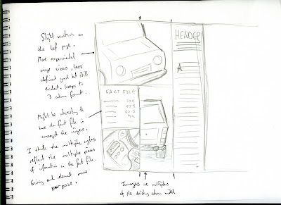
I sketched out some designs based on the idea of having a single image but using alternate angles of the car. I added some annotations next to the sketches that are all in the sketchbook. The ones that seemed to look the best were the ones with moving shots of the car. I'm being more and more interested in achieving this shot as it's an easy way to make a car look dynamic which would tie-in the image with the article. I just need to figure out a way to do that.
One of the most important things about this article (or any article) is the balance between image and type. In my sketchbook I tried to plan out how I would use a grid to set all the design elements in a balanced way.

When setting an image of the car across both pages I can't just have it slap bang in the middle because this would look bad when folded. I don't want to lose too much information down the fold and I don't want to break up the image too much.

 Referring back to my research you can see that in Audi magazine they've set the image of the car across both pages but with most of the image on the left hand page. The face of the car sits centered on the left page whilst the tail sits on the opposite page. This is so that the most eye-catching part of the image is undisturbed and not much important information is lost in the fold.
This how I plan to set the photo of my car in my layout. I can then balance the left page, which will be largely taken up by the car, by setting the article on the opposite page and aligning it slightly further to the right-hand side. This compensates for the lack of photographic information on the second page.

To solve the problem of having the car facing away from the article I can frame the shot so that the road leading off into the distance arrives where the article begins. This will give the image and the article some continuity and should hopefully give the reader a lead from the image to the text.

If I align the top of the article to the top of the car this add further continuity between the image and the type and should ensure that the readers' eye doesn't have to travel too far when following the car to the start of the header. This also allows me to set the fact file in the corner of the left page in the space that isn't taken up by the shot of the car. If the fact file sits aligned with the top of the car and the header this creates a line that the reader can follow horizontally from the first page to the second and then back again. 

I did plan to set the pull quote in the bottom left corner of the spread because this would mean there's a piece of information in each corner which helps balance what's going on in the middle, however it may be more suitable to swap the pull quote with the fact file so that the first thing the reader will naturally look at when they open the spread is the pull quote (since we usually read from left to right, top to bottom). And this is useful because the pull quote is supposed to entice the audience into reading on. The only thing that worries me about that is the amount of space I'll have in the bottom left corner if I want to place a whole fact file in there. It may end up looking too cramped. I want to allow each design element space to breathe since this is a more minimalistic approach to the layout design. I will experiment with this when I start building the grid in InDesign.

Although it's hard to tell exactly what dimensions all the design elements will be I thought something like a 6 (or possibly 7) column grid would be best suited for this layout as this would give me more control when spacing the article from the image of the car, compensating for the relative lack of control I will have of the image once it's been taken.

Wednesday, 3 August 2011

Researching Grids

Grids are one of the most important parts of a double page spread. The grid allows the designer to construct their layout in a way that is clear, consistent and that guides the reader through the article from start to finish. For my layouts I will need to consider what type of grid I want to use in order to achieve certain results.

To do this I rented a copy of 'Making and Breaking the Grid'. A book all about the concept of using grids in design with explanations and examples. I scanned some of the pages I found particularly useful and wrote took down some notes whilst reading them. This information will is really useful as I can apply these theories of grid design when designing all four of my spreads.


This page shows a diagram explaining the basic components of a grid layout. This helped me learn some of the terms that I weren't already familiar with. It then goes on to explain the four main types of grid structure.
Manuscript Grid
  • Simplest of grid structures
  • Large rectangular area that takes up most of the page.
  • Designed to accommodate extensive continuous text like a book or long essay
  • Developed from hand written manuscripts that led to book printing
  • Must be careful in using wide paragraphs as the reader can get lost and find it difficult to find the next line beginning
  • Creating visual interest is important to constantly engage the reader, since the type acts as one grey block of text
  • Adjusting the proportions of the margin is one way of introducing visual interest. Wider margins help focus the eye and create a sense of calm or stability. Narrow lateral margins increase tension because the live matter is in closer proximity to the format edge.
  • Asymmetrical structures introduce more white space for the eye to use as an area of rest. Also provides place for notes, spot illustrations, or other editorial features.
Column Grid
  • Information that is discontinuous benefits from being organized into an arrangement of vertical columns.
  • Column grids are very flexible
  • Can be used to separate different kinds of information
  • The goal is to find a width that accommodates a comfortable number of characters in one line of set type size.
  • Margins that are wider than the gutter focus the eye inward easing tension between the column edge and the edge of the format.
  • Flowlines are horizontal lines that define the vertical width between the edge of the format and the top of the article. Additional flowlines in the middle or bottom can establish areas that are image only or are for a different type of text like a pull-quote.
Hierarchical Grid
  • These grids conform to the needs of the information they organize.
  • Based on more intuitive placement of alignments and proportions
  • Column widths and intervals between them tend to vary.
  • Webpages are examples of hierarchical grids. Webpages require the design to consider how browser windows can be resized which eludes the strict modular approach.
  • This kind of grid is an almost organic approach to the way information is ordered.
Modular Grids
  • Extremely complex projects require a degree of control beyond what a column grid will offer.
  • Essentially a column grid with a large number of horizontal flowlines that subdive the columns into rows
  • Creates a matrix of cells called 'modules'.
  • Each module defines a small chunk of informational space, grouped together these are called spatial zones.
  • A modular grid lends itself to the design of tabular information like charts, forms, schedules, or navigation systems
  • Aside from practical uses the modular grid has developed a conceptual aesthetic image that some designers find attractive.
  • Between the 1950s and 1980s the modular grid became associated with the idea social and political order. These ideals have their roots in the rationalist thinking of the Bauhaus ands Swiss international Style which celebrate order and clarity of form.

Initial Ideas

These are some initial sketches I did for the car layout based on the photos I took and the research I'd collected on existing spreads. (These are all found in the sketchbook accompanied with this blog).


Out of the ideas I've had so far I'm quite interested in the one above. I want to move away from the more formulaic designs of car reviews and do something more like Retro Car or Audi Magazine where they use one main image as the background. I think for the Ford Fiesta this would work because it's so well-known and such a common sight on British roads that one bold eye-catching image would be instantly recognizable to an audience that was interested in cars.

Since the article is more about how the car feels to drive rather than analyzing all it's features, I don't need to explain to the audience what it looks like from different angles because it's iconic enough that everyone already knows. The tone of voice implies the audience has prior knowledge of this car before turning to this spread, which is highly likely. If I can make the car look more dynamic I think this will help sell the article in this light. As the article suggests, it should look fun, excitable, and still relatively modern.

Also on a personal level I do want to gain experience in setting type against a photographic background so I think this will be a good opportunity to do so.

Tuesday, 2 August 2011

Test Shots

After I found a location I thought would be suitable I took my car out with a Casio Exilim 8 megapixel camera and took some test shots to get a feel of how well the car would look in this location, as well as how good it would look when placed in the layout design.


Light is probably the biggest issue here. I think the light reflecting through the branches looks good in some shots but not in others. I think it depends where I put the car and which angle I was shooting from. I think there are potentially some good shots though. Also in low light levels the silver of the car doesn't stand out very much. In good light with lots of greenery there seems to be a nice contrast between the two. I think I could have done with some more close up shots if I had the time.

I will go back on another date with an SLR and a clean car to get more professional shots that will actually appear in the final piece. The photos I have will come in handy as I can create mock layouts and test different compositions between image and type.

Article First Draft

This is the first draft of the article I'll be using. I looked up some information on the history of the car and tried to mix that with opinions on what it's like to drive from the reviewer's point of view. Bare in mind though, I'm no journalist...

What do you think of when you hear the name Ford Fiesta? Predictable? Reliable? Gets you from A to B without fuss? But hold on… isn’t fiesta supposed to mean fun and excitement? Parties and good times all round? Surely Britain’s beloved hatchback wasn’t that dull, was it? Lee Vidal’s been taking an old Mk 4 Zetec for a spin for find out.


The extensively revised Fiesta Mk 4 put the fun back into functional during the mid-1990s. It was as good to drive as any rival super-mini and still looks fairly modern, with curvy, youthful styling, though it’s less radical than its funky little sister, the Ka. Ford's bestseller got a fresh lease of life in the form of 16-valve engines, improved suspension and handling, good security measures and modern safety features.


The Fiesta may bring you and your weekly shopping home in one piece, but a twitch of the throttle reveals the excitable yipping terrier under the bonnet jumping up and urging you to go faster. In that sense at least, it certainly puts in a good effort thanks to its lively 1.25 and 1.4 liter Zetec engines and great grip which makes it fun to drive all round, even today. It’s arguably stood the test of time better than any of its old rivals besides the unbeatably well handling Saxo. As a result of the refined suspension there were also vast improvements in the ride quality over previous incarnations. The Mk 4 handles the bumps and potholes of country lanes with relative ease and you won’t have to slow to a crawl every time you encounter a strategically placed speed hump in the road. And if racing over speed humps takes your fancy then it’s a good job this Fiesta had a 3 star n-cap rating with driver and passenger airbags as standard.


And because it’s a Ford the engine should run and run, which is definitely more fun than braking down. If it does, it’s cheap to repair. Finding spare parts for a Fiesta is like find sand on the beach. Okay so I’m clutching at straws now but really, the Fiesta is only as boring as you make it. Sure you may end up in the passenger seat if you take a turn too sharply, and the dash is about as interesting as a documentary on the history of stamp collecting but I stand by my belief that the Fiesta is and always has been as entertaining and delightfully fun-filled as its name suggests.