For some initial design inspiration I had a look at this guide from online design magazine Specky Boy which has some examples of really good layout design.
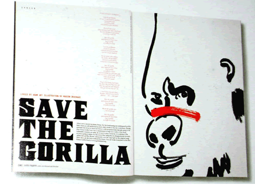
I really like the way the designer has used type in this layout. The imagery and the typography work really well together to create one interesting looking piece of design. I also like the unconventional way the title and main body are set, with the article sitting almost inside the header itself and the typeface used to create the header looks really cool. What's also interesting are the paragraphs that run down the page in red. It's an interesting way of setting type which I hadn't considered before.
Even though the article itself is quite short, the design of the spread is so eye catching and unique it makes you want to read it. This has shown me how creative you can be when designing a magazine spread, as a well designed piece does not have to follow the conventions of most magazine layouts.

I found this layout particularly inspirational because it made me realize you can create a spread on literally any topic, even a typeface. And it still looks really well done. I really like the way the designer set the type to display the characteristics of this typeface. It's simple but really effective.
No comments:
Post a Comment